Problems with Shaw UX & Points of opportunities identified
UX BRIEF
As a student/first time user visiting the site, our main goal would be to familiarise students with all the course offerings available. Unlike an eComm site, we aren't representing a free range of products that people will browse. eLearning is built around a more informed decision. So our goal should be to make the student feel completely informed of the courses we offer and what they can learn and gain out of it, by the time they reach the signup button.
PROBLEMS IDENTITIED
Now how do we fail at providing this User Experience?
HOME PAGE
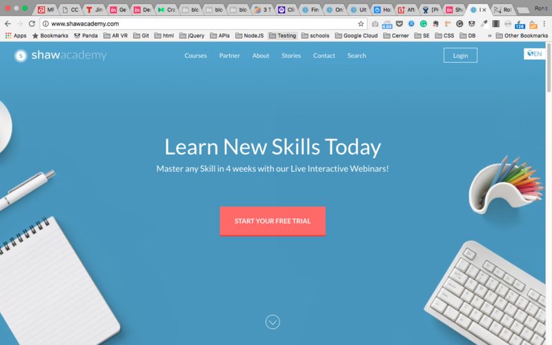
- As soon as we land on shawacademy.com, the sole focus goes on "START FREE TRIAL NOW" CTA. Users might feel that instead of being familiarised with products, the goal seems to be to get the user to sign up.
- Redundant CTAs: What's a CTA? A button that let's a user perform an action/make a decision that will lead to a resolution (in their case, getting a course or signing up. For us, a lead!) But...
This is NOT a cta -

This is also NOT a cta -

WHY? Because they do not lead to anything. It just makes the user scroll to another point on the web page.
What does that mean? The user is at a place he is not supposed to be. He needs to take another action first (i.e. selecting a course)
- Lack of transparency on how the whole process, memberships work. The membership plans offered are confusing. There needs to be a dedicated section/page explaining how Shaw Academy works, how people can attend courses, and the various memberships offered.
The sole focus on home page should be to display our offerings and get the user to pick a course
CTAs Colors -
The best CTA colors are considered - Red, Green, Orange/Yellow.
But our primary color is Blue, and red on blue is a not safe https://webdesign.tutsplus.com/articles/why-you-should-avoid-vibrating-color-combinations--cms-25621
So Red CTAs, while great to catch user attention, need to be in the right place. The home fold is not it.
- For the first fold we are wasting the most important space by telling the user to "learn new skills today". This is pointless because -
a. A visitor to an eLearning site already knows they are here to learn something
b. This tagline does not give any idea of what our company has to offer, except live content
c. Redundant buttons, just to scroll, when we can directly show what's more important = courses.
PRODUCT PAGE
- Aesthetically poor design - there is just too much white and text all over the page. There is not harmony or flow of information to guide the user.
- Lack of Curation - We offer very well crafted learning courses, and our product pages should reflect that. Unlike an ecomm site, we have a limited number of products. Anything under a 100 can be easily presented in a much more curated fashion, letting our users know we pay attention to our courses. Take Udacity's Nanodegree pages for example https://in.udacity.com/course/vr-developer-nanodegree--nd017/
- Presenting the membership plan on the top left is a distraction. A user is here to explore the course first. A more guiding way to lead them to the CTA and sign up is required.
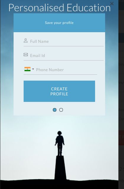
- NO ONBOARDING PAGE/ UGLY SIGNUP FORM
We need a updated form. Also, better selectors for age, gender etc. and faster!
BROWSE PAGE
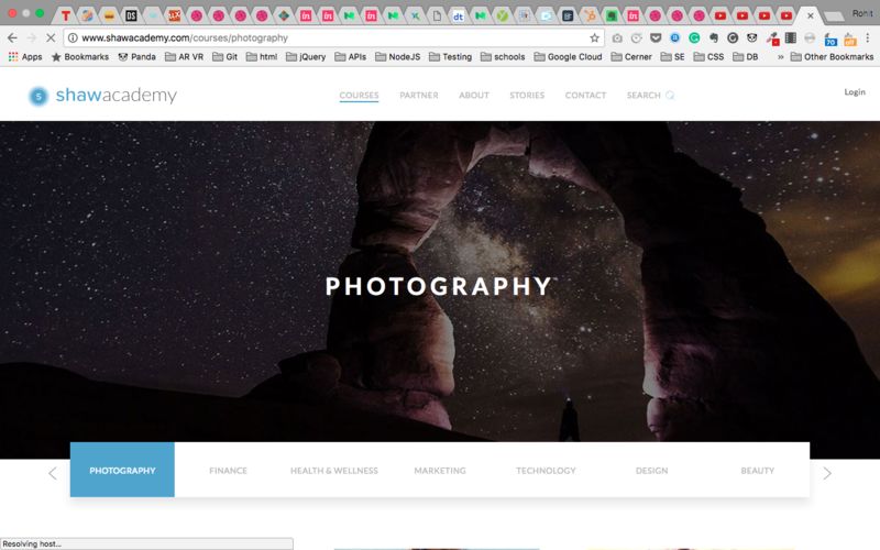
- Wasted fold. Here as we see, the fold has nothing to offer except visual imagery.
- Missed opportunity - Someone who lands here from the home page either did not find the course they were looking for on the home page, or, they aren't sure what course they want to attend, which gives us the opportunity to propose multiple courses under one skill to them. That can be done only by a well presented curation of courses, not a simple listing. Any link leading to a non-product page from here should be remove.
